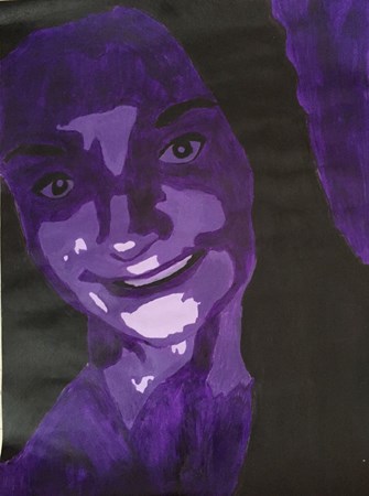
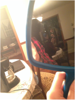
I took this picture a few months ago, and at first I thought the project had to be a selfie. I used photoshop to change the gradient and find a color scheme that I liked. Then, the edited picture was projected onto the wall and I traced it. I traced the lines of my face, my shirt and my hair. Then using purple as a base color, I used white and purple to create different shades to make the gradient. I used the different colors to create the portrait. I found that it was hard to paint my face, and I wish I used a different photo. I think that I could have re-painted my face to make it look more like me, but considering my art skills, I liked the end product.
This is my name made out of different types of materials found around the school. Some of the different materials included pieces of paper, a crown drawing, an Egyptian drawing, a flexible body, a drawing of different triangles and a ruler type of thing. I compiled all these pictures using Adobe Illustrator.
This year has been a valuable year for myself and learning different art skills that I did not know I possessed. One assignment that taught me a lot about my art skills was the paper lanterns project. The paper lanterns project was one of the first times that we transferred what was on the computer onto paper. I never have thought of myself as an artist and never thought I could accomplish anything in art that would actually look good, but the paper lanterns showed me that it was easier than I thought, with a little instructed guidance. I used my skills in Photoshop to make the shapes to cut out, and some artistic skills to be able to exacto-blades to cut out the shapes. The most useful skill I learned from this assignment was that I was able to use the exacto-blades and it expanded my knowledge from just the computer. If I could change anything about this project, I would probably allow us a little more time because the exacto-blades were very intimidating and hard to use the first time. The second assignment that I am going to reflect upon is The Twelve Days of Photoshop. This project was tough, as it had so many parts and they were all difficult. I feel as though this assignment really made me be able to budget my time with the projects and it really expanded my knowledge and skills in Photoshop. Each day taught me something different, and all the things I learned were useful. The most useful skill I gained was learning how to change colors and hues in Photoshop because I had to use this skill multiple times in this project and after as well. I also learned how to be more creative, like using lobster claws for human arms. If I could improve anything about this project, it would be giving the class more concrete deadlines. The third and most difficult assignment was the Selfie Project. The Selfie Project was the most difficult assignment by far and it taught me a lot. The most useful skill I learned in this project was the ability to see the big picture. At the beginning all of the pictures did not look like they would ever go together, but as I continued to edit and think about the big picture, it all began to come together. I put a lot of work into my Selfie Project and it was my favorite project of mine. I also learned a lot about Photoshop in general, which was very beneficial for my future projects. I would not want to improve anything about this project because it was my favorite project and I felt that it went really well. If I had to choose which was the most valuable skill I've learned this year, it would be just the general knowledge I've learned about Photoshop and how to maneuver it. If I could go back and improve any project it would be the project of Creating Illusion and Depth. I feel as though I could have put in a lot more effort and made the photographs a lot more emphasized, as they were not in my original project.
I chose the antonyms of chaos and order because I thought I could illustrate it very well. I considered a brain and a heart because some people are very focused and smart and their heart is chaos and sometimes the situation is reversed. I chose the photos for success because I figured people have different people have different goals and some of them are success with money, success with education, and success with happiness. I liked these projects because I thought the pictures I took were good.
This is my Twelve Days of Photoshop. On Project One, something sliced, I chose to edit a ladybug and I wanted to make it look different. I decided to erase the main part of the ladybug's back and add a gold pattern, which looked good with the red and black. Then I added leaves in the background. For Project Two, turn a pop icon into a sculpture, I choose our president, Barack Obama, and edited him onto a famous sculpture. I did not mean to disrespect our president through this project. For Project Three, literal interpretations, I decided to use the compound word "courtyard" and put a gavel into a backyard to illustrate a literal interpretation of courtyard. For Project Four, bad mail, I edited a toucans beak onto a Fed-Ex box to make it look like an exotic bird is waiting for the person receiving the mail. For Project Five, some scrambled bodies looking all crazy, I edited lobster claws onto a man with outstretched arms and then edited it to make the claws appear more real on the man's body. For Project Six, a holiday mashup, I combined the painting "The Scream" and i put a Christmas tree next to the man in the painting. I wanted it to appear that he was really shocked by the presents. I changed the tree by adding a filter and then changing the color through hue and saturation. I liked this project and the most important skill I learned was having more practice with Photoshop.
I think my selfies came out alright. I like the second picture more because it looks much better. These differ from actual selfies because I am not exactly the main subject and my entire face isn't shown like in a regular selfie. I took my first picture by turning my chandelier that has a lot of power and saw that my glass doors reflected well. I used a hand mirror to get the reflection on my phone. To take the second picture, I used another iPhone's flashlight and held it underneath me in a dark room. The reflective surface is my china cabinet and it reflected really well once the light from the flashlight was added. I put these two photos on Weebly because I felt they really represented me that I took and I felt that they were the best reflections that I took and i didn't want to put on any pictures that I really didn't like and these two were the only pictures that I felt represented me.
This is my selfie project. All of my pictures are unique to me. I didn't include everyone and everything that I wanted to, but mostly everything was included. I had a lot of pictures of my friends, mostly every picture includes my friends, because they are very important to me. My background is the TD Garden because its one of my favorite places. I have pictures of my cats, and a machine shop that I photographed in Canada on vacation. I used the opacity and different filters to make everything bland together and make it look not choppy.
I made my lantern through using Adobe Illustrator to practice making the designs and then using the same program to make my final patterns. I decided to use two designs in my pattern because I wanted to make the lantern look simple, and clean. I used an exacto-blade to make clean cuts to cut out the shapes, then I folded them over. Then I found the best way to photograph it through experimenting when I took the actual photographs. I set up my paper lying flat in the corner of the classroom and there was a light set up to make the shadows look sharp. I put my lantern on a piece of dark purple construction paper so that the white of the paper really popped and the shadows stood out. Then I stapled my lantern together and decided I wanted more light , so my friend used the flashlight on her phone, so the shadows were very clean. I cropped the photos on my phone because there was too much background, and I wanted the lantern to be the main focus of the photo.
Kristen and I decided to make this as our core values poster. We wanted to keep it simple and white to highlight the Millis colors
|
Archives
May 2015
Payton bdbe excellent to each other Categories |